To all those who participated in the vote for our new brand: THANK YOU! With a total of 6420 votes we have seen a great interest from our community. We’ll get to all their opinions in more detail later, but first things first:
It is with great pleasure that we can announce the new AntennaPod app icon and logo by 221pxls!
![]()
The competition
In total, we received 12 proposals. You can find a full list of proposals in a post on Open Source Design. After the call closed we (@keunes and @ByteHamster) reviewed all proposals and provided feedback to the designers. Based on the criteria and requirements set out in the design brief, two proposals were selected for the community vote.
After that, we set up a vote containing the two new proposals that follow the requirements in our design brief best, as well as providing an option to vote for the old design. Voters could give one to five stars for each design, representing an equal number of points.
| Alpha | Bravo | Charlie |
| By MyNameIsTroll | By 221pxls | Old |
| 21314 total points | 23323 total points | 21718 total points |
The charts
The total points listed above gives a straightforward indication of the winner. But we wanted to look into the votes in more detail to better understand how each of the proposals was received.
Apart from the total score we found it interesting to see how many users accept a proposal, even if it’s not their favourite. The plot below shows that 60% of the users generally like proposal bravo, while fewer than 50% like the other proposals.
![]()
Also noteworthy is that 42 users loved all proposals, giving each a five star rating. On the other side, luckily only four users did not like any of the proposals and gave them all 1 star. The old design (charlie) invoked the most strong opinions, with 4% of the voters awarding the existing design 4 or 5 stars while giving the other proposals only 1 or 2 stars.
Differences per group
The survey was shared among different groups: Google Play Beta users, our Twitter followers, a random group of Google Play users, and our F-Droid users. For each of these groups we distributed another link to the poll. Below, you can see the rating distribution across different groups. For each group, the bravo proposal was rated best. You can also see the number of participants form each group.
The poll was open for a bit more than a month. The F-Droid users replied so fast that after 3 days we already had 3328 participants and closed that collector again. For Google Play users, the poll was opened for more than a month to get a more equal distribution between different types of users. The poll was rolled out to 16,000 random users on Google Play, out of which 12,700 installed the update and 1994 voted.
![]()
You can find additional interesting charts here: icon-poll-charts.pdf. If you want to have a look at the raw, anonymized vote data to create your own charts, you can find it here: vote-data-ratings.csv. The R script used to generate above charts is available here: icon-poll-charts.R.
Text comments for an evening or three
We know - it’s been quite a wait for those of you who were looking forward to these vote results. In respect of both our community and the hard work of both designers, we wanted to go through all the comments and relay relevant feedback to the designers. So, over the span of several evenings @keunes and @ByteHamster went through over 4000 open comments.
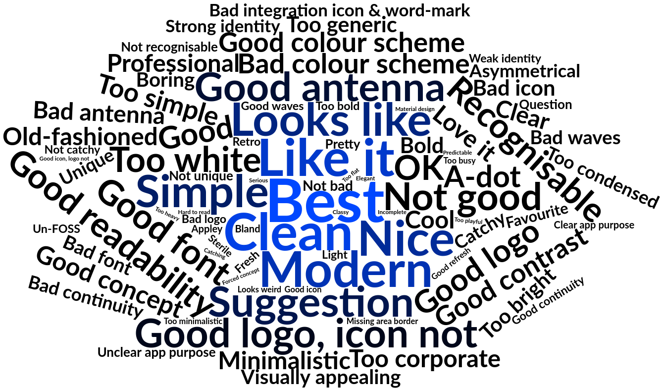
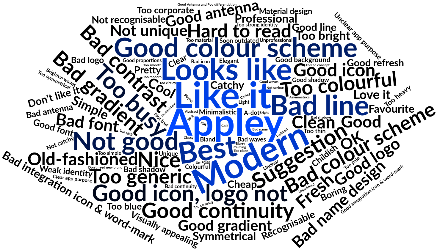
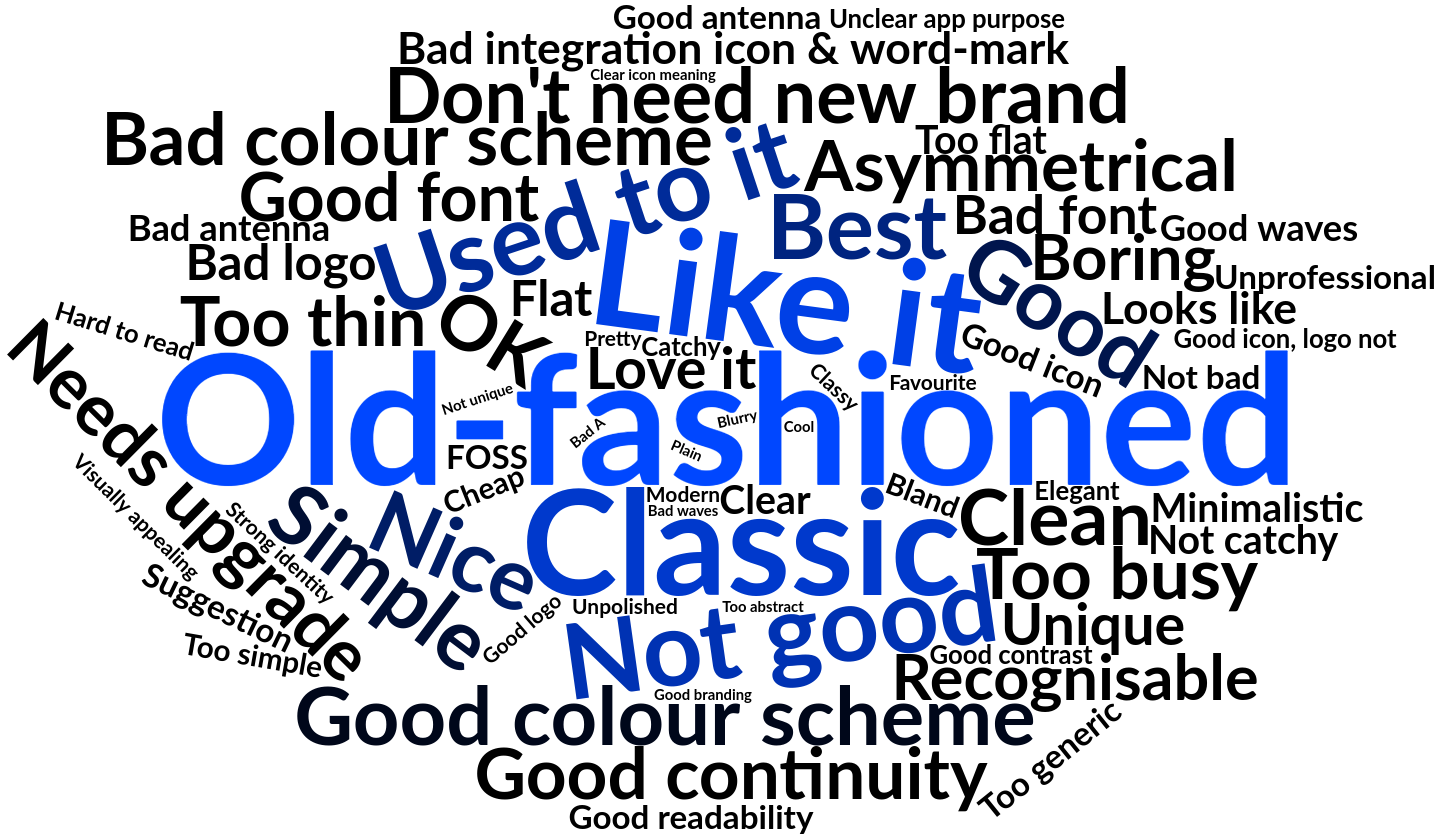
Each comment was tagged with one or more categories. After initial tagging we reviewed the list with categories, and made some adjustments to improve our tags. Unfortunately that took a bit longer than preparing the script for the graphs. But the result are the insightful word clouds below! (You can click on them to view a bigger version. We have used a non-linear scale for the word clouds to ensure that both frequently noted and rarely noted words are readable)
| Alpha | Bravo | Charlie |
 |
 |
 |
After the comment box for each of the proposals we also asked respondents if they wanted to leave a generic comment. Many of them thanking the developers for their good work. Going through all those comments was heart-warming.
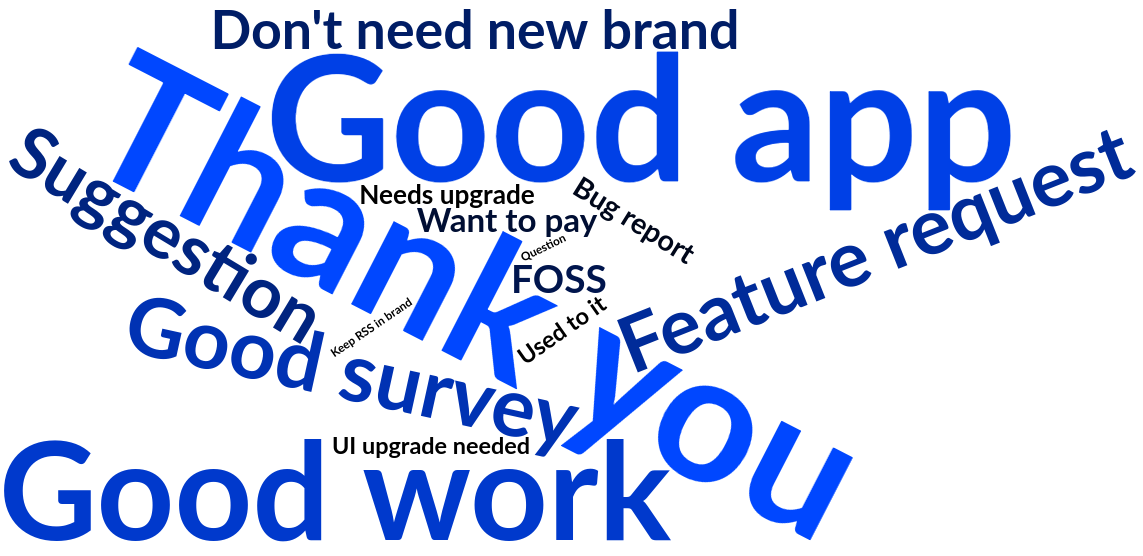
Let us share a small collection of the many nice comments below. Dear all volunteers, developers, translators – let this speak to you!
You, reading this, good work. Hope your day is as good as you’ve helped make mine all by having a nice functioning app experience
I’ve never been more excited for a software update before.
Thanks for AntennaPod! It’s incredible! You certainly would have reason to feel proud of your accomplishments there! A great example where Free Software excels!
Thanks for making this great software! You provide an essential service to many of us and should sleep well at night knowing you’re positively contributing to our world. Thank you!
Some of the plain-text comments contained support questions or feature requests. Given that we don’t know who sent these comments (it’s a survey, after all) it’s not possible to reply to them, but rest assured that we’re keeping them in the back of our minds. If you did have a support question, feature request or bug report, please create a topic in our new forum so we can help you :)
If you want to have a look at the tagged comments data (not the actual comments) to create your own charts, you can find it here: vote-data-comments-tagged.csv. The R script used to generate above charts is available here: comments.R.
Post-vote changes
As we wrote in the design brief, we provided important feedback to the designer of the winning proposal based on the open comments, taking the opportunity to tweak the design slightly. The logo presented at the top of the page is the final result of these iterations.
Before we let you enjoy your podcasts, we want to thank again all the designers that replied to call on Open Source Design, and in particular MyNameIsTroll and 221Pixels. We hope that you - our community - are happy with the result of this process and will warmly adopt our new face. We will soon release the official release of version 2.0.0 which will include the updated visuals.
